

VISUAL IDENTITY
Lucy Folk is a luxury Australian lifestyle brand inspired by travel, art and design. Their most iconic pieces are interpretations of objects or experiences that have significance for Lucy, who is both the founder and a goldsmith.
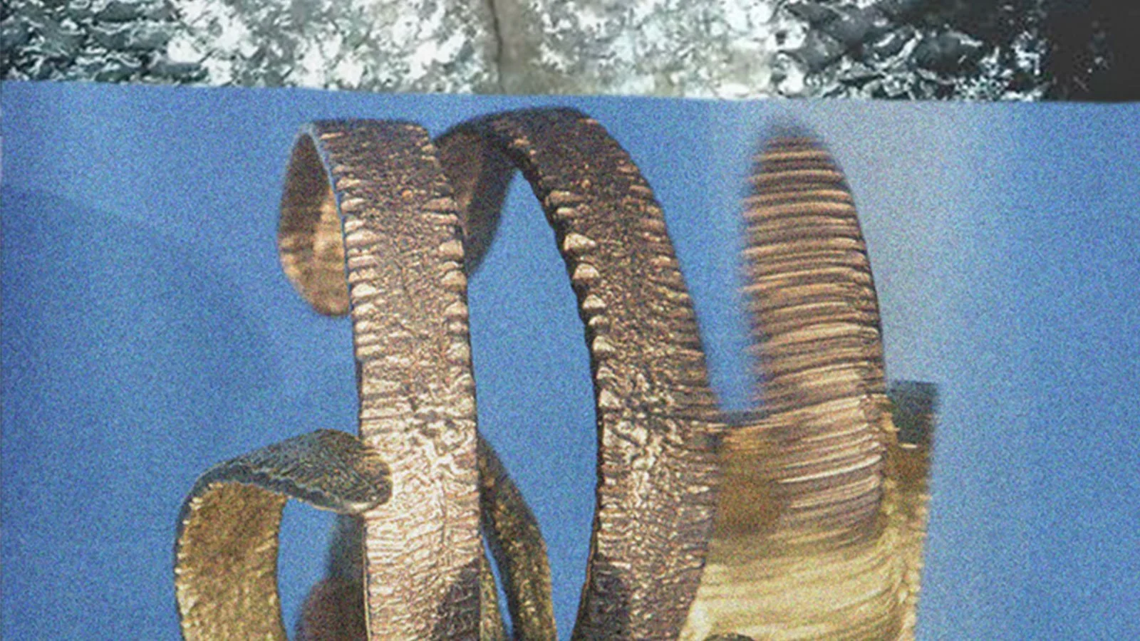
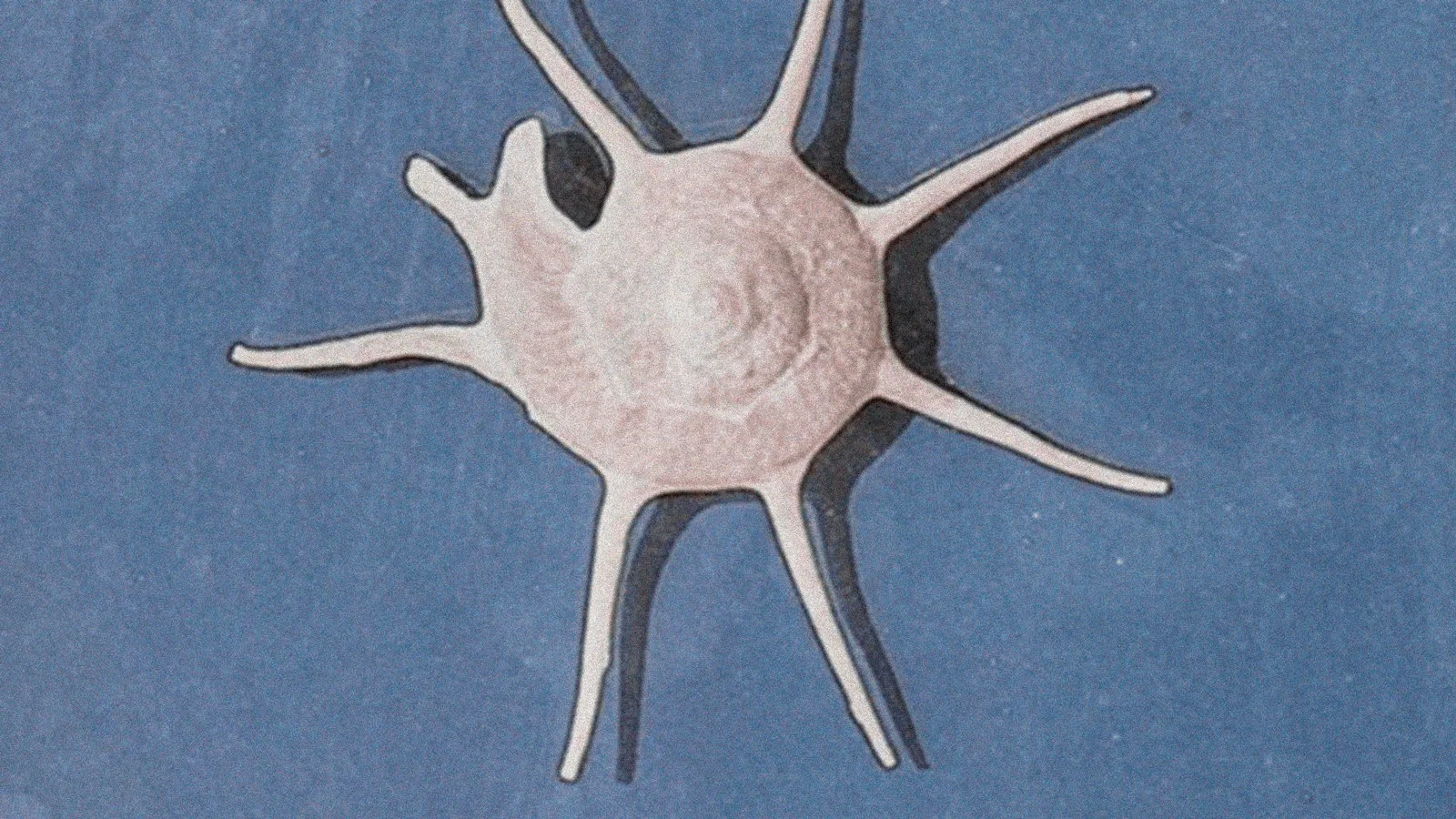
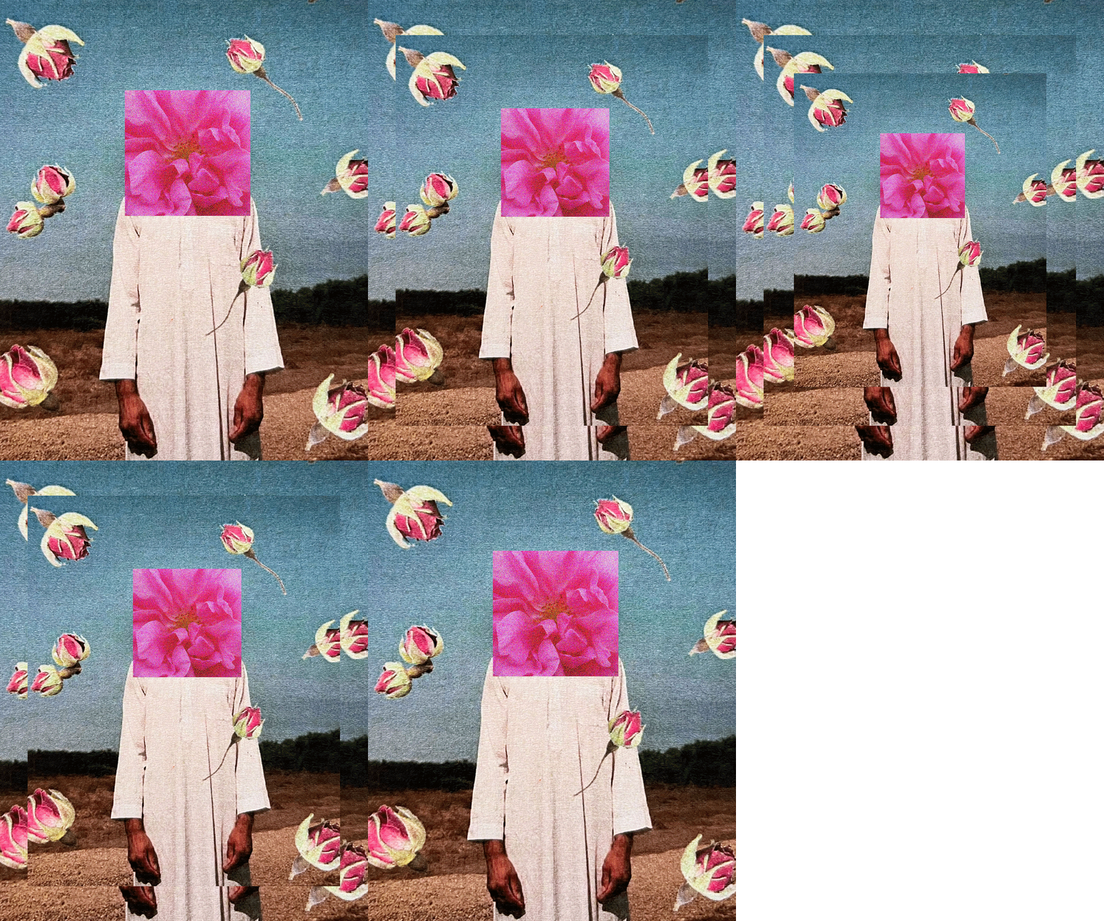
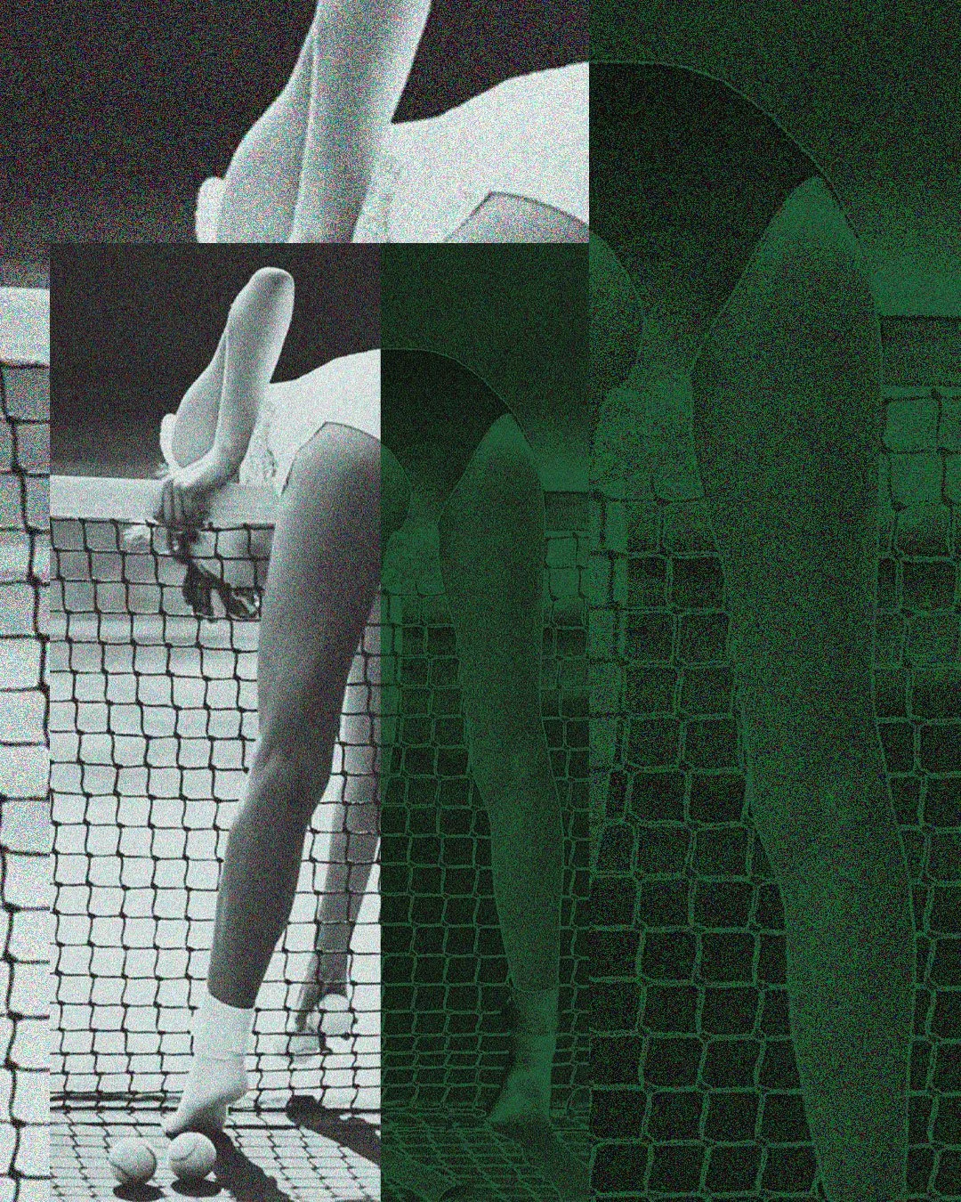
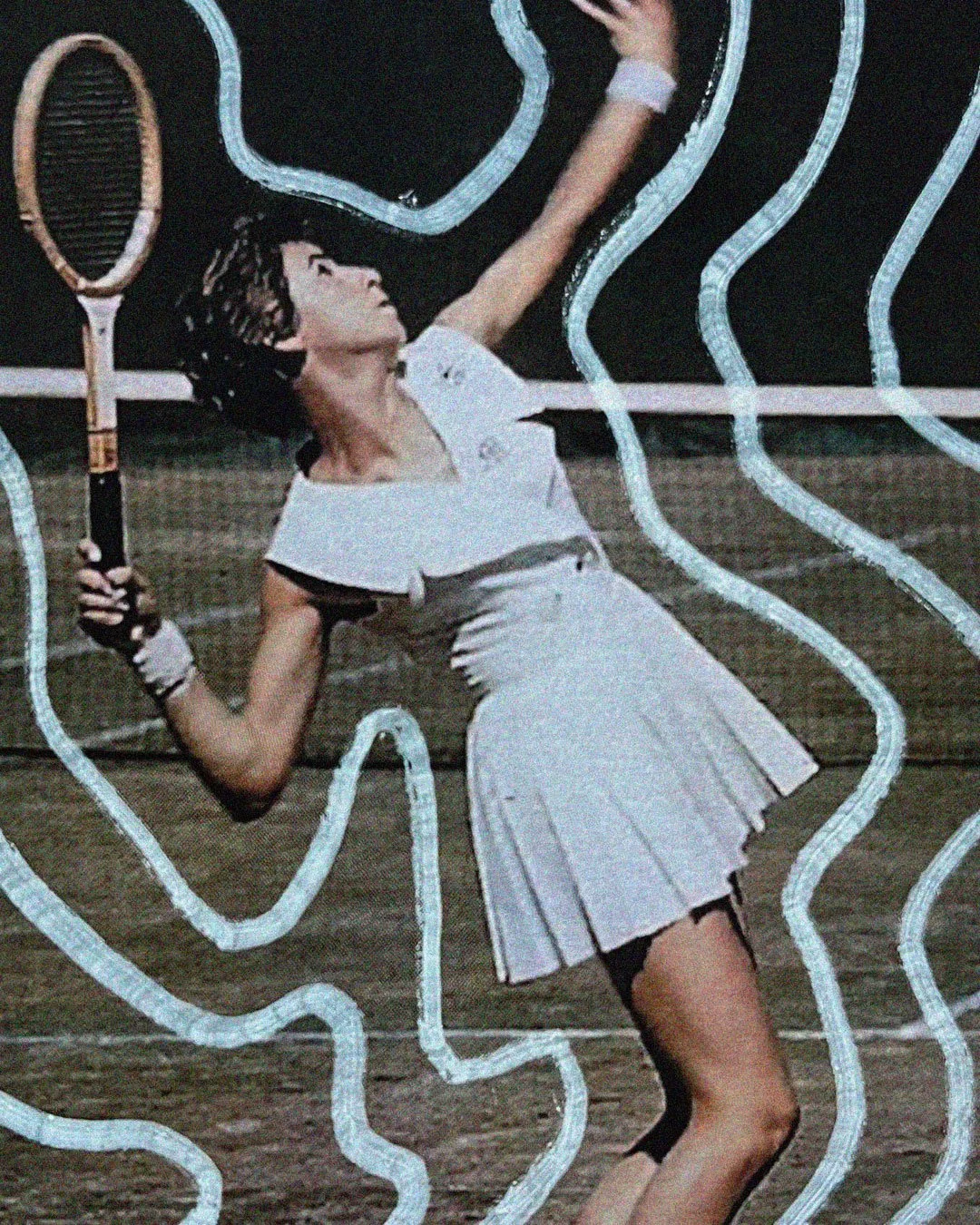
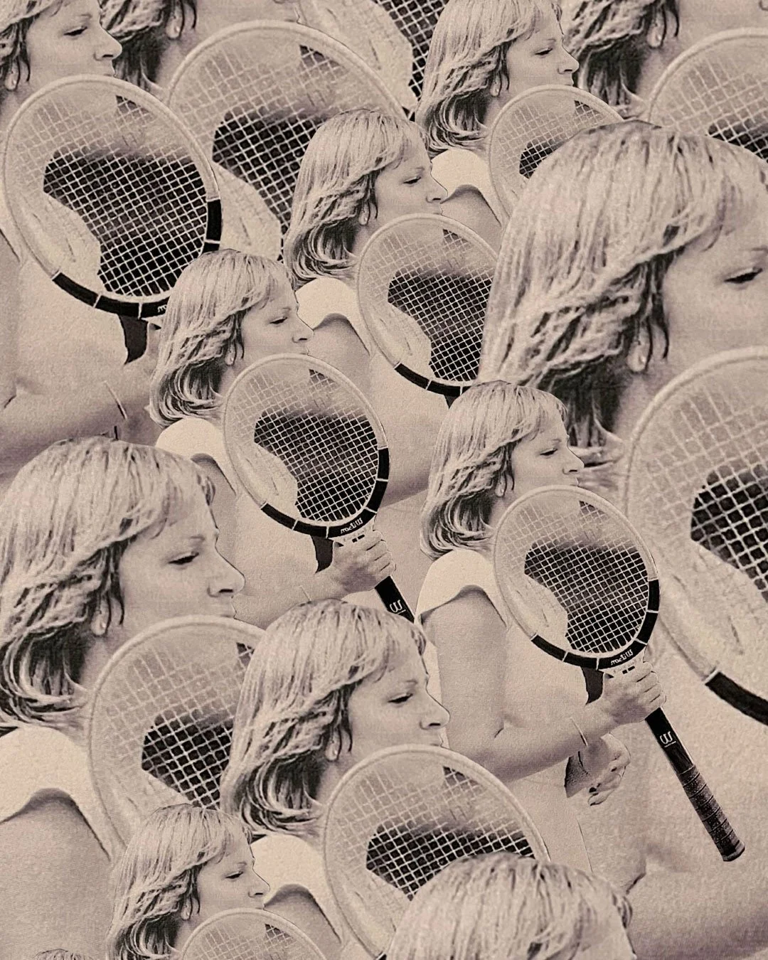
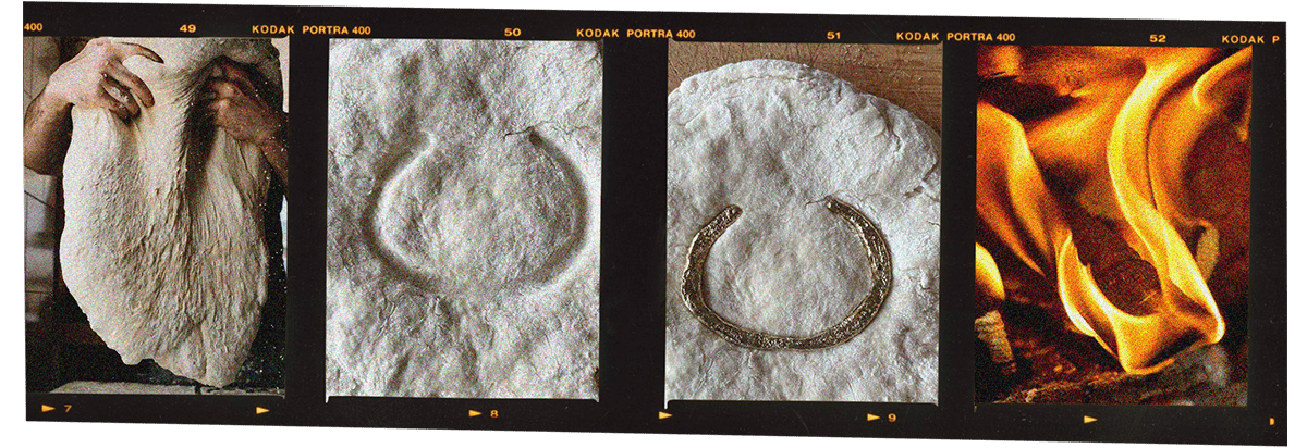
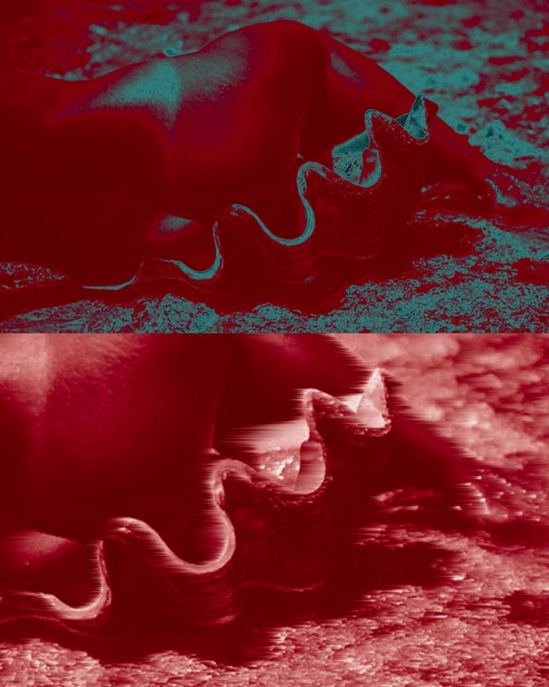
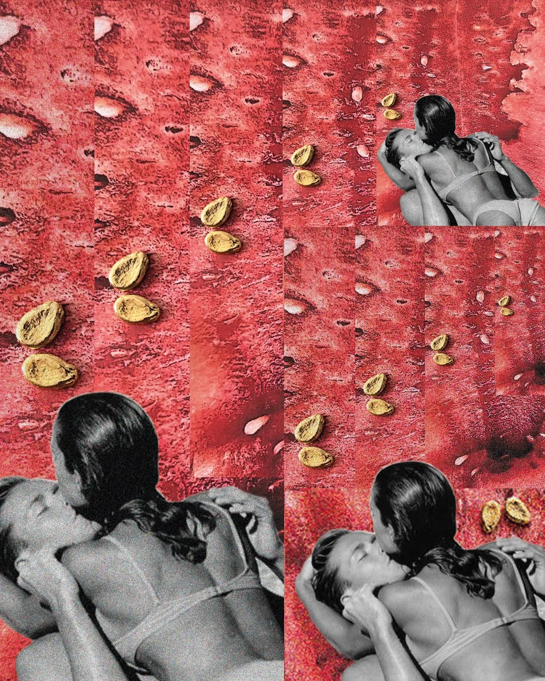
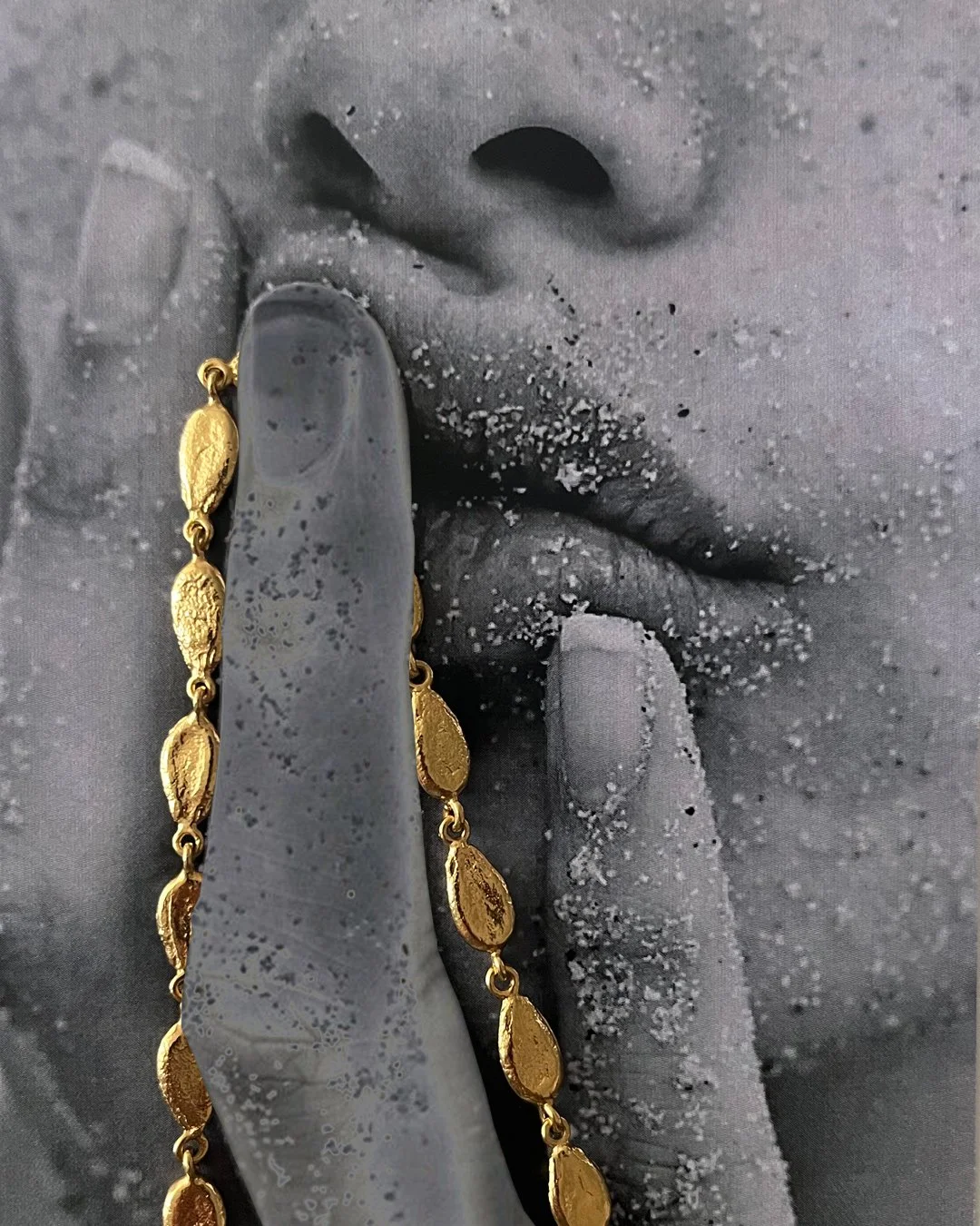
I developed a visual style for their series ORIGINS, that tells the stories behind their most iconic pieces of jewellery. The series included seven stories: Anchovy, Medina, Chromatopia, Tennis, Dough, Tete-a-Tete and Watermelon. I created the mixed-media collages for each of them using archival imagery, product photography, and - when available - physical samples. I designed them to be as unconventional and tactile as the products themselves. Each collection in the series is distinct, though they live together as a set.
LUCY FOLK


THE CREATIVE PROCESS
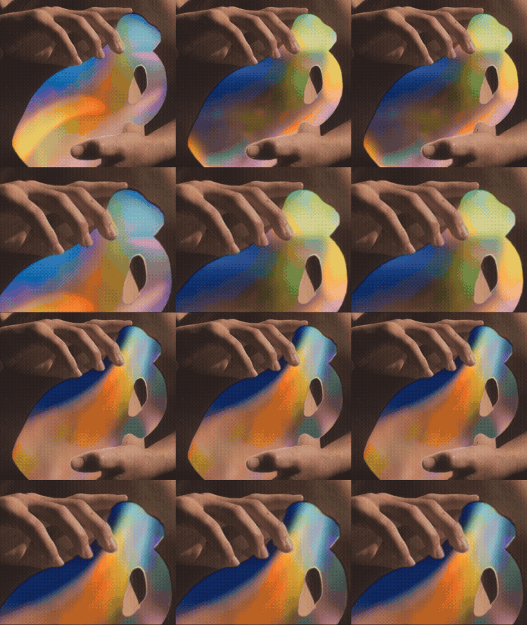
The foundation for each piece is imagery that evokes the mood of the story. They were printed, hand cut and assembled, and then painted or drawn onto directly using a range of media including paint, pastel, pen and ink. I brought all the hand crafted pieces back online to arrange the final composition and digitally manipulate some components.
In this image from CHROMATOPIA (a story about chakra equilibrium), I drew energy lines with a pastel onto an image of the goddess Shiva, and used a crystal to cast refracted light.

“Sophie was resourceful and inspired. She produced beautifully unique artwork, unlike anything seen in the Australian jewellery industry at the time. Her commitment to deadlines was unwavering, and her dedication to the project was palpable throughout. Her talent and professionalism made our collaboration a pleasure, and I would highly recommend her for any creative endeavor.”